Sunday 23 October 2011

Week Four

In this lesson we were focussing on shading. We had a couple of tables set up in the middle of the room with a cloth covering them, onto this shone 3 different light sources: two lamps and the sun. I needed to look out for different types of shadowing being created, normal shadows, where areas receive little light (or no light at all) and cast shadows, where a different object or even the same object is blocking the light (object shadowing and self shadowing).


This is the first quick sketch I drew. I spent about 3 minutes getting the shape right, then the rest of the time I spent shading. I concentrated most on the darkest places, which I shaded quite hardly, then I tried to achieve a balance by adding in lighter places. I don't think I did this very well, though if I had spent more time on it I wouldn't have rushed it and would have achieved a better outcome. From doing this sketch I learnt that I need to practice drawing more quickly with accuracy.


My personal feedback from the previous sketch was to focus more on cross-hatching. I tried to do this, but didn't achieve the look I was going for. My cross-hatching effect turned more into scribbles than an effective shading technique. The only part of this sketch I like is at the top right, this is because I think the progressive tonal difference of the hatches work effectively, showing that the darkest shadows were at the top and it gradually got lighter. As I had never done cross-hatching before I don't think my attempt was too bad, but it has shown me that I need to practice it.


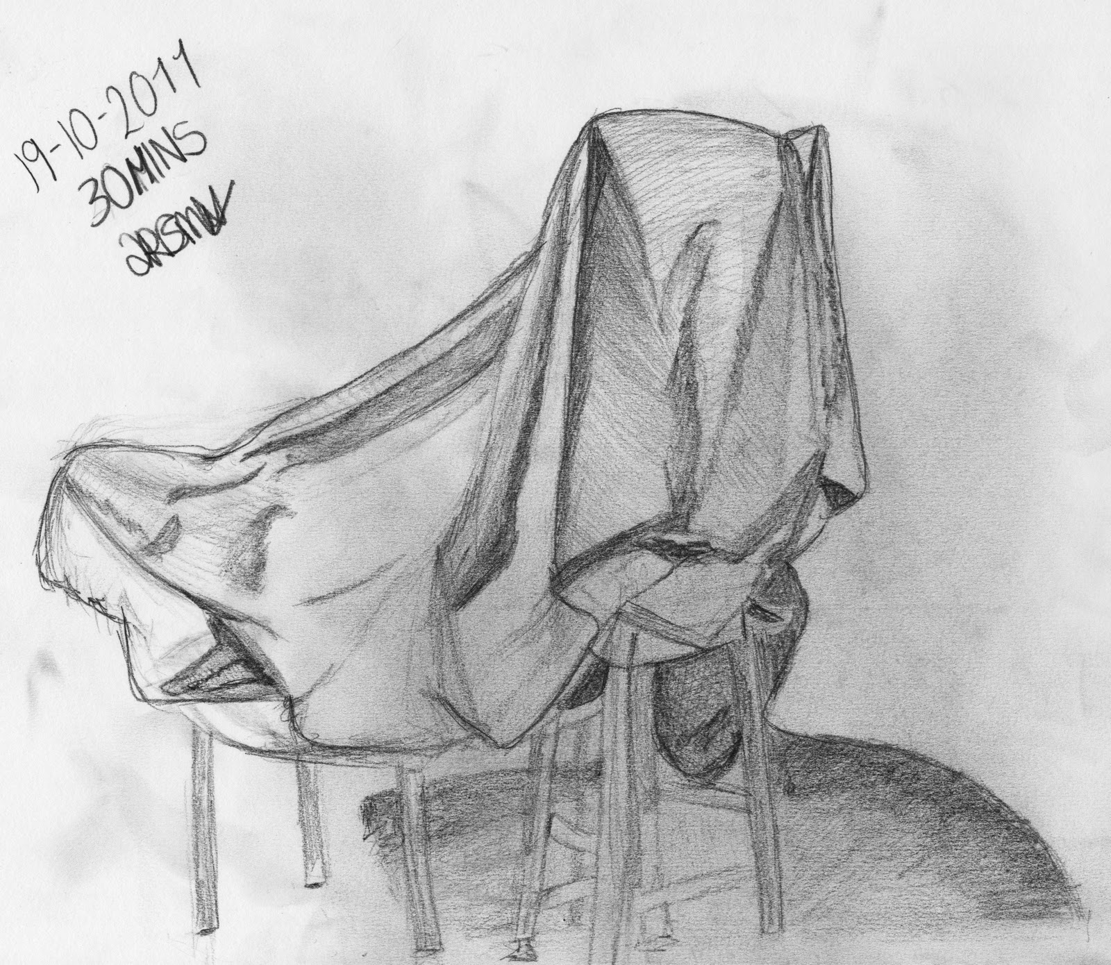
This was my final sketch of the lesson. I spent about 7 minutes getting the shape right then the rest of the time I spent on shading. I feel that this is by far my best attempt at drawing the item. I have managed to get varied tonal differences which have created a 3D look and feel to my sketch. For example, the folds on the right of my image actually look folded. I spent a lot more of my time on the right of the sketch and possibly neglected the left a bit, but I wanted to concentrate on getting a smaller part more detailed so I ran out of time for the left side. I wanted to include part of the shadow on the floor as I really liked the light effect that was seen, I tried to translate this look onto the paper. Overall, I am happy with this 2B pencil sketch even though there is always room for improvement.

Saturday 15 October 2011

Week Three

This week our lesson was focussing on composition, meaning that we learnt how to be aware of the placement of the objects in our drawings. The point of having a good composition is so that when the eye looks at the picture it looks at the whole picture not just the main focus point. Our task was to sketch out different views in separate boxes on our page:


I tried to get each picture to be different to the other. I played around with the compositions and even played around with the angle of the picture (bottom left). In the middle right picture I used the rule of thirds, I achieved this by placing the main focus (the light) onto the top right line intersect, by doing this the eye instantly looks at the whole picture, compared to if the light was right in the middle of the sketch, the eye would have just looked straight at that.

My favourite sketch from this session is the top right. The reason for this is because I like how you get a real sense of looking up at the image from on the ground. I think I have achieved a good composition on this image as when looking at it the eye doesn't go straight of the page when it gets to the right hand side, instead it gets caught on the bottom of the bridge and gets taken back around the picture again in a flowing motion, this creates more interest to my image. 

I feel that my weakest picture this week is the doors at the bottom right, this is because I feel that it lacks good composition, the eye tends to just look at the doors at the bottom and not the rest of the sketch. Although, having the poles at the top right does help to balance the picture out slightly and adds a bit more interest. However, I do like how simplistic it is and feel that this makes it easy on the eye.

Tuesday 11 October 2011

Week Two

The second observational drawing lesson was outside in the car park. This lesson was all about perspective, we were trying to bring 3 dimensional objects and draw them onto a flat surface. Our task was to draw the buildings around us.


I started off by drawing what I thought was going to be a 'safe' place, but it turned out to be a really bad decision, as you can see all the buildings were facing the same direction which made it flat and there just wasn't any interesting angles and lines to add to it, so I rapidly stopped and changed my position.


I am much more happier with this drawing. I feel that it has a lot more depth to it than the other. I think I have used the technique foreshortening well as the building looks like it is going back into the distance from the foreground as the lines I drew above and below are going diagonal towards the same point. My picture uses a two-point perspective as when you look at the corner of the building there are two sets of parallel lines moving away, each to their own vanishing point along the horizon line. I really struggled with the windows at the top of the building, as when I first drew them they made the building look tilted, I tried and corrected them but they just didn't go right. My favourite part of this picture is the curved wall coming out of the building, I like this because it gives the overall image a 'complete' feel by adding more shape. I like the shape of the lines that got created by drawing the wall. Overall, I am pleased with the outcome of this 2B pencil drawing.

Week One

Week one was our first drawing session in which we practised drawing lines, circles and spirals which then progressed into shading, the basic skills needed.


Above is my picture of the table and box we had to draw. I drew what I could see, rather than what my brain told me should be there, this is why the box has rounded corners and most of the sides aren't straight. I tried to include the shadow in my picture as well, I think I managed to get the basic shape of it correct, although it is slightly strange. If I had more time I would have shaded in the box to make it more 3-dimensional.